Beyond a UI Kit
A design system is not a Figma file with pretty buttons. It is a shared language between designers and developers—a living ecosystem of components, tokens, patterns, and guidelines that ensures consistency across every screen your users touch. The difference between a design system that gets adopted and one that gathers dust is how well it integrates into your team's daily workflow.
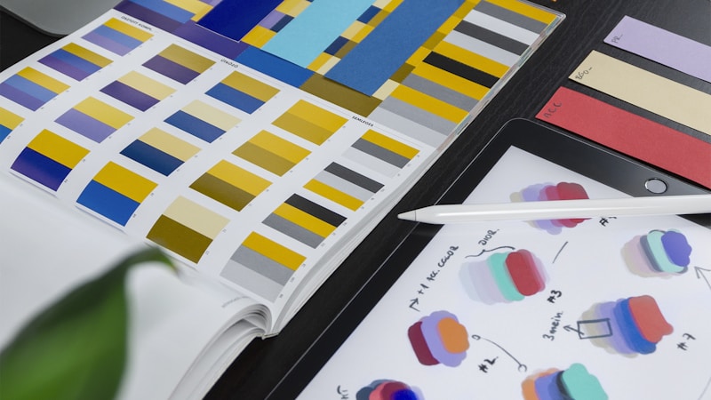
Design Tokens
Start with tokens: named values for colors, spacing, typography, shadows, and border radii. Define them in a platform-agnostic format like JSON and generate CSS custom properties, Tailwind theme extensions, and native platform constants from the same source. When the brand color changes, update one token and it propagates everywhere. Tokens are the single source of truth for your visual language.
Component Architecture
Build components at three levels. Primitives: Button, Input, Badge—atoms with no business logic. Composites: SearchBar combining Input and Button, Card combining Image, Text and Badge—molecules that combine primitives. Patterns: PageHeader, DataTable, FormLayout—organisms that define page-level structure. This hierarchy makes components discoverable and composable.
Each component should have a clear API with well-defined props, sensible defaults, and escape hatches for edge cases. A Button component might accept variant, size, and disabled props with defaults that cover 90% of use cases. For the other 10%, accept a className prop that lets developers extend without forking.
Documentation That Gets Read
Every component needs a live playground in Storybook or Histoire, usage guidelines with do and don't examples, and auto-generated prop documentation from TypeScript types. If developers have to read source code to use a component, your documentation has failed. Make the happy path obvious and the edge cases discoverable.
Versioning and Release Process
Publish your component library as a versioned npm package. Use semantic versioning: patch for bug fixes, minor for new components, major for breaking changes. Maintain a changelog. Run visual regression tests with Chromatic or Percy to catch unintended changes before release. Automate the release process so publishing a new version is a single command.
Governance
Designate design system maintainers who review contribution PRs. Establish a request process for new components: does it solve a recurring problem? Does it follow existing patterns? Can it be composed from existing primitives? Without governance, the system drifts into an unmanageable collection of one-off components that nobody trusts.
Conclusion
A design system is an investment in consistency, velocity, and quality. Start small—tokens, a few primitives, and basic documentation. Grow it based on real team needs, not hypothetical future requirements. The best design systems are the ones your team actually uses every day.
0 Comment